Sunday, July 10, 2016

Stair step card... to celebrate cake?


Doesn't it sounds healthy? I really liked a card a saw lately using this stair step look, and thought, I must figure that out! So, hopefully, you don't have to. I have included detailed steps that even I could follow them!


I made these wonderful

diagrams this time, because I found this card so difficult!

Step 1: Cut a paper to 8x10.
Step 2: Looking at the paper with the long sides being top and bottom, the shorter sides the edges. Score a the 3,4,5,6,7, inch marks.
Step 3: Turn the paper so it seems the short sides are top and bottom. Sliding the page into your cutter go in to  1 and 1/2 inches. Reading the ruler on the with the slicer cut from 3" to 5".
Slide into the cutter to 3". At this point slice from 4-6 on the reading of the slicing ruler.
Slide further into cutter to 4.5". Slice here from 5-7".

Step 4:

You will need two of the step-looking paper. If it is a forgiving pattern that does not require to face a specific direction you could carefully cut them at once, from a 10 1/2 x 5 1/2" paper. Otherwise place two pieces together, one turned upside down and cut once that way.

Place you paper on the slicer at zero point. Sliding down to 2 3/8" cut 1"down from the top.
Slide it in to 3 5/8" mark and slice down 1".
Slide it in further to the 4 5/8" mark and slice down an inch.

Step 6: Go back to sever the paper at each slice ending.

Step 7: Cat 4 rectangles that are 3/4 x 1 1/4".

Step 8: Adhere these to card.

Step 9: Adhere your chosen image, letters, and sentiment to the card!

Now, I am NOT math-y, so you must take the idea and make it your own size on your own, lol. This requires a large envelope, so of course it could use modification if you want to save on stamps ;).

My stamp is from www.mosdigitalpencil.com  (no surprises there, lol). She is called The Birthday Girl. She would be fun on scrapbook pages or blown up As a coloring page, too.


My sentiment is all me!


Birthdays are for
Having your cake,
And eating it too!


The best birthdays begin with cake,
              end with cake,
and have a little cake in the middle!
If God didn't approve of cake
he never would have made
birthdays so varied.
Sorry I forgot your birthday,
Just giving you a reason
To eat more cake!


I'm almost certain, no matter the trouble,
A nice slice of birthday cake will fix it.
Especially, if it's not your birthday.


Saturday, May 21, 2016

Confession Of A Hoarder

Like many crafters, I hoard not only regular supplies, but office supplies as well. Come school shopping time I load up on ten cent folders and quarter pencil sharpeners like I actually have a use for them. Then the 'drives' happen and everything I bought from last year goes into a bin outside the store I am re-loading up at. One such supply addiction is post it notes. I had learned a few years back to make a very cute, clever holder that fits into your purse, but immediately found myself upgrading the design to fit my needs. My much larger needs. See, when I use a post-it note, I tend to use somewhere between three and thirty. Even my notes are rambling. Oy!
So I rehabbed the design and made it Tracy friendly, to fit a useful size note. These are often available at the dollar stores in multi packs. they are rarely actually sticky so you have to 'stickify' it yourself. Perhaps with super red tape. The supplies you will need are:

2- cardboard pieces sized 6 1/2 x 4 3/4
2- pretty papers, 7 x 5 1/4

velvet, leather, suede, or other magical papers:
1- 2 x 6 3/4 piece
1- 9 1/2 x 6 5/8 piece
1- 1 1/2 x 3 piece

one Velcro sticky dot

paper pad
decoupauge glue
any gems or glitter you may need to 'fancify' the cover


The first step to this fabulous folder/holder is to decoupage those cardboard pieces with your chosen pretty paper. Feel free to add stamped images, photos, or zany sayings. when you have your paper in place fold in the excess, this will keep the look professional, rather than snipping right along the edge.
While those are drying fold your 1 1/2 x 3 inch piece of magical paper so it is now 3/4 by three, with whatever beauty it holds showing both front and back.
Use your 2 x 6 3/4 inch piece of magical paper to join the cardboard pieces, leaving a half in between them. Your magic paper will overlap both cardboard pieces and secure a 1/2 inch space between them. This is necessary to accommodate the notepad. Use glue only on the backside, so as not to ruin the beauty of your spine.
Flip this over. You should be looking at the 'ugly' side of the cardboard and a 1/2 gap of the back side of the magic paper. Halfway down the right edge you will glue the small strip about 1/2 inch in. Smother he wrong side of the magic paper with decoupage glue. Seal in all that ugliness with this beautiful paper. 
Secure your notebook in place by whatever means necessary. Add a Velcro dot to the end of the flap and remove the adhesive backing. Close the cover and allow the Velcro to place itself where necessary! Add bling, with gems, stickers, glitter, whatever!


Friday, May 6, 2016

Desktop Decor

Sometimes I just want to play. That's when I pull out the coloring books, or print up a coloring page. This image inspired me to play, and I couldn't wait to frame it and build some flowers. The image is from mosdigitalpencil.com and the Flower Builder Sizzix is from Stampin' Up!.http://www.stampinup.com/home/en-US/ (use demonstrator ID 2163910 for shopping).

My two darling girls inspired the color choices, With the little one loving purples and the older one loving blue. The background is a digi paper available at mosdigitalpencil.

My favorite of the flowers is the off white, which is (drumroll) coffee filters! The red is shimmer is available at Joanne's (http://www.joann.com/crafters-companion-shimmering-cardstock---candy-red/14220180.html). The purple is a double sided cardstock that is older than my children, so I really don;t know the brand. Centered in each flower is a adhesive enamel dot, available at many sources including Stampin' Up!

Tuesday, May 3, 2016

A Sticker Situation

We all have those stickers that do not have a use; all consonants, weird sayings, random numbers. I am here to remind you there is a use for all this. These old school tips and tricks are tried and true... and often forgotten.

First off, think of journaling. Is there a place where a beautiful font might start off a journal-ed sentence? How often have you read in books, 'Once Upon A Time....' where just the O is super fancy? It is in this spirit you might work. What about words to highlight, within the sentence? Using the same idea, just use that 'Z' as you write zealous! Another great way is at names, or just initials. Go ahead and use those numbers instead of writing out seven.

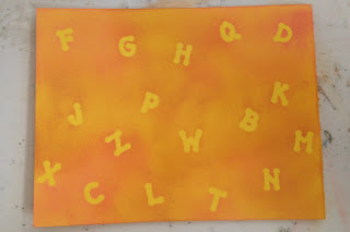
Next, think of them as stencils! Lay them on your paper and ink or spray around them! In the case of a strange sticker shape, I revert back to journaling; use this 'empty' space to journal or doodle in! Once the ink has dried, gently peel the stickers off. You will have a fabulous paper, and no one will notice a lack of letters or numbers.

My example and instructions uses 'Bedtime Story' from Mosdigitalpencil.com.

1. Lay your stickers on paper, choose ink or sprays that go well together.
2.Begin by randomly inking areas with one color.


3.Add second color.


4.Remove stickers.


Create!


Monday, April 18, 2016

The Other

I love to think outside the box when I buy new stamps or stamp sets. While they are new and the excitement is fresh is really the time to do this. One rule I have for making sure I get my money's worth is to make one card, one scrapbook page, and one 'other'. The 'other' is the most challenging part. Sometimes I think and think on it, and sometimes, like in the case of Mo Manning's Neighbors I knew before I even bought it. I saw this stamp and couldn't wait to decorate my new address book. My old address book had lasted years, with scribbles and stickers covering old addresses, names I no longer recognized, and some names that brought back smiles and fond memories, but where nonetheless obsolete. I loved making this and likely will make some gifts this Christmas using the same stamp. This stamp is great for cards such as; welcome to the neighborhood, congrats on your new home, we've moved, come to a house warming or invitation to a block party! It can be found here: http://www.mosdigitalpencil.com/neighbors/
If you decide to challenge yourself to my standard of making sure you get your stamp value, some other 'others' I have done have been jewelry, bookmarks, wall art, magnets, and stamping on fabric. With these digis I suppose you would print them on iron on transfer paper to do that. Share your ideas in comments. Thanks for stopping by!


Wednesday, April 6, 2016

A comparison of coloring options

Note: All images from:

https://store-04628.mybigcommerce.com/cart.php?tk=hk3gpisaauegr8vi699bealb91


I was playing around with a fab background image, adding different secondary images and thought, why not color with different mediums? It is easier to see the difference when so much of the image is similar, in this case the background (lighthouse). So here is a comparison of a few. There are others, and I love them all, and there may someday be a part two. But for now, we have what we have.

Starting off my favorite way to color; art pencils with mineral oil to blend!

Used along with Harvest Aquina, who is collecting muscles along the beach after the first lighthouse, powered by candles, was built. I love the softness of using the pencils and blending out from an image. I struggle with small spaces, getting a shaded look without a lot of area to leave 'white' spots. Then I struggle with open spaces where there is not a lot to color in. Still, I love the soft look achieved here. It is peaceful and sweet. the downside is, of course the time. This is he most time costly way to color, so I only send these cards to people I really love.

Coming up next was one colored simply using fine tip markers, Sharpie's, Le Pen's and Papermate. I will say I like the Sharpie's best, they are smooth and bleed least. Oh, I did try to make the sand blend out with one Chameleon pen ;).


The positive here is that this is the fastest way to color I have found. Just straight coloring with no blending either using fine markers or pencils is quick, therapeutic, and still has a nice end result. But it's just nice. My problems with it are: the doubled over areas, the bleeding capacity when I am trying so hard to stay in the lines, and the limit of colors. Although the final might be fixed by having multiple brands I found blues were too similar between the Sharpie and Papermate, that's when I called in my Le Pens. The Le pen's have a very fine tip which was enjoyable, but again colors were limited. Still it's a good enough card to send to someone I like. I added a mermaid to the water here (Mermais Kailani) and some fun embellishing, making it a bit more darling. 

Finally I played with my Chameleon markers. For those unfamiliar with these, they are an alcohol based marker system where each pen is used to create multiple shading affects of that color. 

I struggled with the sand, I will admit it right up front. I added more color, removed color, and just couldn't get the right look. Then, I decided, if the waves had been ebbing and flowing like they do, maybe the sand would look this way. The sand is done using one pen. The ocean done is using one pen. The grass (not the bushes/trees) is done using one pen. This is a very efficient way to color. There is a limit of pens, but they are manipulable, saving money (compared to other alcohol based pen systems) and space on the craft table. The time is slightly longer then fine tip markers, but way less than artist pencils. In my opinion the look is slightly less desirable than art pencils, but much better than fine tip markers. Image used is Summer Sisters. I added a punched edge and a circle punched sunshine. I would send it to someone I love. 

Other forms of coloring: water color pencils, ink and blender pen, chalks may be featured in another blog. Things you will not catch me using; Distress Markers (mine dried out ridiculously fast), any form of crayon (too unpredictable), or Gelatos (again, unpredictable). Yet, every time I say never.....


Friday, February 12, 2016

Gorjuss Girls


Here is proof I do use stamps other than Mo Manning. Just not often, lol. To play with these aptly named Gorjuss stamps I decided to stick with the use of metal paper embossed behind them. So, I have the consistency of the brand as well as similar designs. I enjoy these cuties, even though the lack of mouths bugged me at first. I considered adding them, but I am no artist, just a lowly crafter.
I really love the way an embossed background shows up on metal papers. I hoard these papers for the occasion when I get out all the fun embossing folders. This is a really nice thing that embossing folders bring to the table, as when I work with metal stencils and a light box there would be no way the design would show through the thick metallics.
I used my usual Prisma colored pencils with a blending stub and mineral oil. No matter how it turns out I feel revived and I have fun!